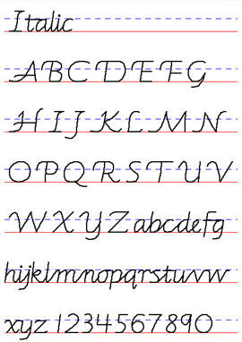
Video
Draw and write with a child. We create drawing lessons and include writing practice—especially, handwriting practice. This is an introduction to Draw-Write-Now, our eight-book series.
Your Custom Text Here
Draw and write with a child. We create drawing lessons and include writing practice—especially, handwriting practice. This is an introduction to Draw-Write-Now, our eight-book series.
The way you hold a pencil can be a huge help when drawing or writing. This is a demonstration on how to hold a pencil.
Children with poor motor-skills need training in handwriting and should not be told to simply forgo the pencil and use a computer to write.
A bright teen came to me for help. He wrote only on the computer and found that there were times when it was necessary to write by hand. His lack of handwriting experience hindered him with illegible and slow writing, but more significantly, he had problems composing without a computer. He was unable to mentally outline an essay—he had always used cut and paste to organize his thoughts.
Poor motor-skills can improve with age and practice. As a young child, this teen should have received help with his fine-motor and gross-motor development, and the standard of perfect penmanship should have been loosened. His caring parents would have helped him, but they were told, "Don't worry, he will write with a computer." As it was, this bright and motivated young man saw the need to catch up and simply worked on it himself. For some, an occupational therapist trained to work with handwriting can make the difference.
The computer is a fine tool for writing, but not when it keeps us from exercising our brains. Handwriting practice that leads to a legible script is a terribly important skill for growing minds. It is a necessary skill that should not be taken lightly.
Speech, writing, grammar, spelling, vocabulary—the parts and pieces of Language Arts. They fall into the categories of creativity and craftsmanship:
We send our booklet, Hold the Pencil, in every order we ship. Get it with an order or download it now...FREE (pdf, 493 pdf)
Some children easily transition to the Tripod Grasp. For others, it is a challenge to keep the fingers in the tripod position. There are a variety of tools available to help keep the fingers in place. They are temporary tools, much like training wheels on a bicycle.
Some children use the tripod grasp naturally. Others may simply need to be shown and encouraged to practice.
Some children might benefit with a triangular shaped pencil as a little reminder to keep the fingers in a tripod position. Also, there are grippers that slip onto a pencil to make it triangular.
Grippers with indentations or cups for the fingers help those who have a hard time keeping the fingers in place.
The Twist n' Write Pencil takes a different approach on holding the pencil and helps those who have established a grasp that is harder to change.
Teaching a child to write their name and first words is fun and easy, but before you get too far along, be aware that there are a variety of types of handwriting— they are called handwriting styles.
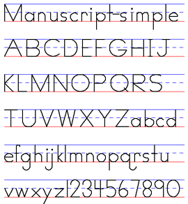
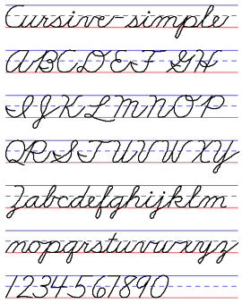
Primary or elementary schools agree on one handwriting style to teach—at least they should. If your preschool child is eager to write or your child is already attending school, but you don't know which style is used, contact the local school office and ask.
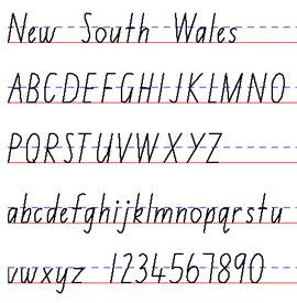
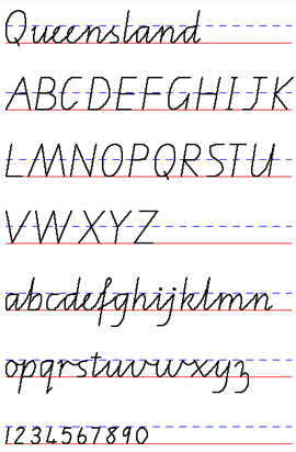
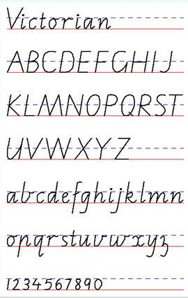
Homeschool parents—you get to decide! It's nice to find a style that appeals to each child, but I've found that it makes sense to stick to one style for the family.
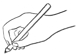
With any handwriting style, there is a slight modification that can help a left-handed child write more smoothly. It's simple—pull the pencil toward the hand when making horizontal lines. For example, a right-handed writer crosses the letter “t” from left to right. For the left-handed, the letter is crossed from right to left. The following letters are affected:
Lowercase letters: t, f
Capital letters: A, E, F, H, I, J, T.
Handwriting styles are designed with a manuscript (print) and a cursive (linked) form. Progressing to the cursive or linked form is the goal, as it is the quicker or more fluid form of handwriting. Today, many children get handwriting instruction and practice for only a few years at best and may not get instruction in cursive. I encourage teachers and parents to include regular handwriting practice into sixth grade. Keep practice time short—ten to fifteen minutes. For older children, practice time may be only once a week.
Yes, it is fine to start in cursive, and most children love it. When Marie was a child in the 1920’s, all her handwriting was in cursive. Manuscript was introduced later and used for labeling maps or posters.
Each style has it’s own character or fits certain needs. There is no "correct" handwriting style—although publishers of handwriting programs or language arts programs might feel that theirs is the best! A handwriting chart or some other reference on how letters are formed (letter cards with the starting points and arrows, alphabet strips, iPad app) is a good reference tool to have available.
Simply be aware of letter formation and model it for your children or students. When given no instruction or example to follow, bright children can come up with some terribly awkward and cumbersome ways of making letters!
Whichever handwriting style or type is chosen, the personality of each child's handwriting is evident.
One child may space letters wide. Another might slant their letters less than the child sitting next to them. Some tend toward narrow lettering. Then, there are those who have a confident flow to their writing.
Our uniqueness shows in our handwriting. It is our style.
Handwriting programs have instructions and books and gadgets and apps. For many people, it is not necessary or practical. The main thing is to help the child memorize the letter formation (there are many fun ways to do this) and have clear standards and expectations for their practice time.
A handwriting style is a carefully designed, efficient way of forming letters and numbers. Each style has its own character or fits a certain need. The most common styles are shown here.
Most of these examples were created
with Startwrite Handwriting Software.
I like New American Cursive. This form of cursive is simple and clean. The child learns to write using cursive—they start with cursive. There is no manuscript form, although, the capital letters F, Q, T, and Z are made like manuscript capital letters. Another option would be to start a child with Zaner-Bloser Continuous Stroke Cursive.
Handwriting Without Tears is a simplified style, without a slant, and has a rather blocky feel to it. Developed by an occupational therapist, the program includes many tactile products for writing readiness and an app for memorizing letter form. It is popular in the United States, but I find it too simple. It is not beautiful and the cursive doesn't flow.
Printing - Handwriting Without Tears
Cursive - Handwriting Without Tears
Modern Manuscript (D'Nealian) starts with slanted manuscript letters with the intent to transition easily to cursive writing. As in cursive writing, the lower case manuscript letters are made with one continuous stroke and most have "tails" (see the letter "a".) Modern Manuscript gained popularity in school districts in the United States in the late 1980's. Some find it challenging to teach (the program includes auditory instructions) and dislike the manuscript "b" and "k." I like it, but tend to teach it with modifications.
D’Nealian - manuscript and cursive chart
D’Nealian - manuscript only
This style is neither too challenging or too simple. Zaner-Bloser was the dominant handwriting style in the United States until Modern Manuscript (D’Nealian) gained popularity and this “continuous stroke” or “simplified” Zaner-Bloser was introduced. The continuous stroke applies to the manuscript letters—the pencil is not lifted to form a letter, as with the original Zaner-Bloser style. The cursive was simplified and most notable, the letter "Q" was changed to look like a letter "Q" instead of an odd number "2." Continuous Stroke makes sense—it is the closest thing to how Marie taught manuscript letter formation. When she taught cursive to first-graders, she used A Beka — that's what the private school chose.
manuscript - uppercase & lowercase
The original Zaner-Bloser style and the Palmer style are not used as much now.
manuscript - uppercase
manuscript - lowercase
cursive - uppercase
cursive - lowercase
Spanish
Peterson includes a transition between printing and cursive—it's called Slant Print. I don't have a sample to show here, but did include links to the site. Peterson's theme is "the difference is rhythm." The cursive letters end without a curve, much like the Italic styles. This program includes a depth of information, prompts and help. It seems like a lot of work, to me.
Print
Slant Print
Cursive
Italic is so lovely and appealing! There are a variety: Portland Italic, Barchowsky, New South Wales, Victorian, Queensland.
Italic charts (click “Chart” in the left-hand column)
Barchowsky Fluent